We are so glad you are here as we continue our discussion about color! In the last edition, we covered some important vocabulary and how light affects the way a color appears to our eye. Now let’s get some tips for creating pleasing color palettes.
Light is a type of energy. Different lighting has different wavelengths and frequencies and is not fixed or unchanging. As mentioned, it changes with lighting conditions but is also affected by the other colors around it. For example, if you examine a color surrounded by pure white it will likely look like a different color when you view it next to green or orange.
The complement of a color is the one opposite to it on the color wheel. For example, some complementary colors are red and green, blue and orange, or purple and yellow. Each pair has a warm color and a cool color.
Putting complementary colors together increases their energy. They make each other seem brighter, cleaner and some even describe them as vibrating or singing, when they are together. If you want to increase the energy in a room, decorating with complementary colors is a great way to do it.

Analogous colors are those next to each other on the color wheel. An example of analogous colors would be red, red-orange, and orange. Because these are similar, they flow together and make for a more subtle relaxed feel.
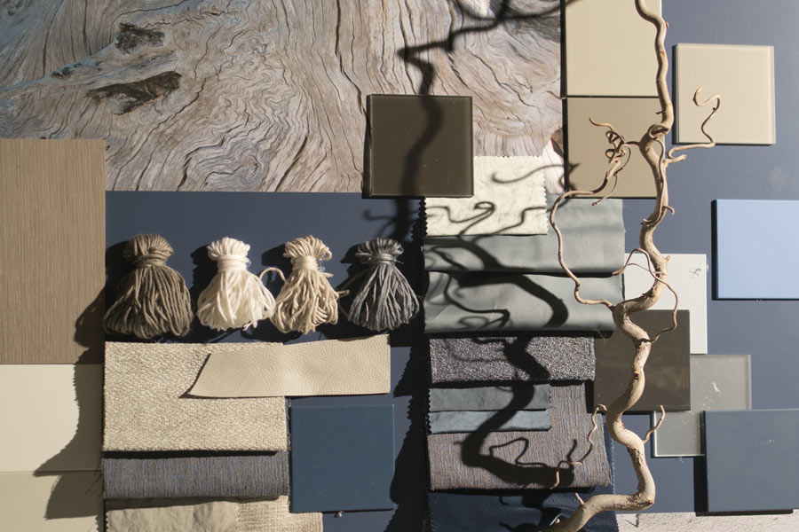
It is important to consider all the colors present in a space and how adding another might affect them. Will they mesh, improve each other, or clash? A tip from the pros: create a mood board. A mood board is a small board containing a sampling of the design elements you will use in one space(See opening picture). It is used to see if they work together and to get an idea of the overall ambiance that will be created.
When you are ready to paint, remember that the color you paint on the wall will likely look shockingly different than expected at first. Do not panic! Remember it is being affected by the colors around it. You will not really know how it will look till the job is done and all your design elements are in place.
With a good understanding of color and some careful planning, you can use color to express your unique vision. Join us in the next edition to get some more tips for choosing paint colors. See you soon!
By My Painter 6-1-2021
Recent:
Categories
Archive
Jul 2024
Jun 2024
May 2024
Apr 2024
Mar 2024
Feb 2024
Jan 2024
Dec 2023
Nov 2023
Oct 2023
Sep 2023
Aug 2023
Jul 2023
Mar 2022
Feb 2022
Jan 2022
Dec 2021
Nov 2021
Oct 2021
Sep 2021
Aug 2021
Jul 2021
Jun 2021
May 2021
Apr 2021
Mar 2021
Feb 2021
Jan 2021
Dec 2020
Nov 2020
Oct 2020
Sep 2020
Aug 2020
Jul 2020
Jun 2020
May 2020
Apr 2020
Mar 2020
Feb 2020
Jan 2020
Dec 2019
Nov 2019
Aug 2019
Jul 2019
Apr 2019